Showing posts with label color. Show all posts

Brand Spotlight: Wild Olive

I'm loving this Italian identity for the Italian Eatery Wild Olive in South Carolina. Designed by Stitch Design Company, the budget friendly identy uses pre-printed tape that is applied to almost anything: menus, business cards, comment cards, etc.


Be True Designs on Rustic Wedding Chic!

Well hello friends, I have decided to come rejoin you after a week or so self imposed blog vacation and labor day holiday! And lo and behold, when I returned I found a shoot I recently did with two of my favorites, Julie Roberts Photography and Ruffles and Rouge Events on Rustic Wedding Chic blog!
The original idea came from an escort card challenge but quickly grew into something way bigger! We took something that might be a little taboo like tobacco and made it into a fabulous down home wedding reception with rustic and southern charm! I think my favorite shots are of the fruit flavored drinks in the mason jars!


{ photography by Julie Roberts Photography, Styling by Ruffles and Rouge Events, paper design by Be True Designs }

Real Weddings: Katie and Mike

Sorry for the lack of posts this week, I have once again been attacked by a cold bug. Seriously, I must have the immune system of a newborn. So multiply me not feeling so hot with a bunch of order and project deadlines and you get a very very lonely blog.

I didn't want to leave you totally hanging, so I'm leaving you for the weekend with some amazing pics from a wedding of one of my brides. Katie really nailed every detail for her vintage farm wedding, and I'm so happy that everything turned out how she's been planning! The die cut invitation is still one of my favorites to date. Click here to view the entire gallery from fab photographer Lori Hensley. Congrats Katie & Mike!

{ images from Lori Hensley }

Inspired By: Lilly Pulitzer

I'm not usually one to obsess with pink and green, but I am really digging the new Lilly Pulitzer Home collection (blame it on this hot summer that has me craving the beach and a cold cocktail)! I love how the collection uses bright pops of color without going totally overboard.
{ image from HFI Brands }

Here are a few of my favorite pieces:
{ image from HFI Brands facebook }

{ image from HFI Brands facebook }

Can I build a bar just to have these stools?
[ image from Horchow }
{ image from Horchow }
And this piece is to die for! It's an ottoman that opens up to show storage for shoes and what not. That Lilly is so clever!

{ image from lovelyish }

Be True Designs on Elizabeth Anne Designs!


What a fabulous way to start a Friday! Be True Designs was one of the vendors featured on Elizabeth Anne Designs this morning for the work we did for this fabulous Julie Roberts Photography and Ruffles & Rouge sherbet inspired shoot! This one was really fun to design because who doesn't love a good die-cut and bright colors? Click here to view the whole post!

I hope you have a wonderful weekend!
-e.n.h.

Be True Designs: Custom Weddings: Pink and Teal Roses

I worked with a wonderful mother recently who was taking charge of helping with wedding details while her daughter was busy going to school, working, coaching cheerleaders and planning a wedding! She was a delight to work for! Lindsey loved the color pink, and was using it with teal, champagne and roses as her wedding inspiration. I found an amazing frame and added some rose details to really make the design ornate. We also used a large metallic 6x9 pocket folder to hold the invitations, reply, reception and direction cards. The large scale paper with the metallic paper really make an impression!

Don't forget tonight is the last chance to 'follow' for a anthropolgie gift card! Click here for info!

I'm spending the weekend with the husband, puppy and his puppy friend whom we're babysitting. Monday will hopefully be spent all day on a boat with friends! Hope you have a fabulous Memorial Day weekend, remember the amazing men and women that sacrificed their lives and time for us to have this time!

-e.n.h.

Rewind & Rewed - The Color Palette

Part one of my Rewind & Rewed series - the color palette. When I was engaged in 2005, I worked at a retail store who's colors were bright pink and orange. Maybe that was the way the idea got in my head for my wedding colors, but I like to think it wasn't and that it was this picture I found in one of my first wedding magazines ( I still have this in an inspiration binder!). I remember seeing this picture and a light bulb popping on over my head. This is it. I wanted a 'sherbet orange with a purple-ish pink'. The one thing I love about it is that the colors were just so lively.
Fast forward to 2011. I'm no longer surrounded by pink and orange in my work space (thank goodness!). I have definitely changed my color and design aesthetic in the past 6 years. I obviously love green, but I'm also digging a subtle teal blue color with a silver or mercury glass accent. I found this image as an inspiration. While the husband and I are not canoe people my any means, we do love the lake and my most relaxing and fond memories are at dusk on a boat in a lake somewhere. So there you go, the new inspiration is a lake wedding. And I think the new colors fit perfectly.
{image found from Oh Darling Photography }
Next week I'll tackle the dress!

Be True Designs on 100 Layer Cake!

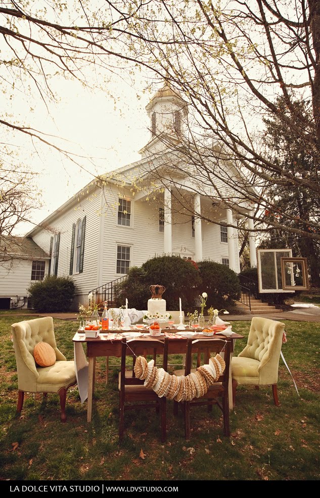
Today is a great day! Remember when I gave you a sneak peek at our Cameo & Persimmon Inspiration Shoot at the end of March (here)? Well the fabulous ladies at 100 layer cake have decided to showcase it to their readers today! Please go here to check it out at their blog (click here)!

So much thanks goes to Shanna Jestice of Ruffles and Rouge Events for her awesome styling, decor and ideas and especially to my friends Melanie and Bradford Watson at La Dolce Vita Studio for coming all the way to Knoxville to take these amazing shots! And a big thanks to all the other great vendors that helped out!

{ image from La Dolce Vita Studio }

Be True Designs: Inspired Wedding Suite : Nautical

It seems everywhere I go lately there are nautical themes, in fashion, in decor and now in weddings! I came across this fabulous picture the other day and thought it makes for a great nautical themed wedding inspiration:
Here's a wedding suite and some other details I designed based off the inspiration photo:
I used the bright primary colors and played with stripes and knots. I think a knot handle tote bag would be the perfect welcome gift for guests to this weeding!

On a side note, I am devastated by all the destruction the south has been put through the past 2-3 days. I spent about 5 years of my life in Alabama going to school at Auburn, so my heart aches for all my many friends and family who are recovering today. We were blessed that East Tennessee didn't take too hard of a hit (power lines, trees and power down). I ask that you take a moment to be thankful to God for what you have and to donate your time or resources to the Red Cross or any other organization that will be assisting in the recovery efforts.

Have a safe and happy Thursday!
-e.n.h.

Color Theory: A Pantone kind of life!

For the non designer out there you may not know that most every color of the spectrum is tagged and marked by a number and corresponding formula. You can thank Pantone's Color Matching System for that. It's the best way to make sure that the red coke can you get in Knoxville is the same exact color as the one you'd pick up in Thailand. Some Pantone colors are even trademarked and can't be reproduced (like a super fancy blue for a store where diamonds and dreams happen...Tiffany's) For me its the best way to get accurate colors for clients, such as when a client wants a color from a bridesmaids dress swatch to put on an invitation. I recently came across some awesome Pantone inspired products. I personally LOVE the cookies, and wouldn't care what color I got!

Knoxville Wedding Inspiration Shoot: Sherbert Fun!

Last Friday we had the fabulous opportunity to work with Shanna of Ruffles and Rouge Events again for a Julie Roberts workshop/inspiration shoot. Shanna pulled together an awesomely quirky and whimsical styled shoot. I did the invitations, programs, bottle labels and signage.

Here's a sneak peek! Can't wait to see the rest of the shots:

{ images from the ever talented and fabulous Julie Roberts Photography }

Style Icon: Kelly Wearstler

Have you ever heard of Kelly Wearstler? You haven't? Well you're missing out. I first saw her as a judge on a Bravo's show Top Design. She was a bit quirky in her design and fashion, but I love it. She is someone who is 'no holds bar', with 'no apologies' for her design skills and ideas, and I respect that a lot. Its someone who I'm constantly striving to be in my own design life.
Anyways I just got some of her books: Hue and Modern Glamour to have in our 'library' at home and once again I'm in love. But the most amazing thing that I've found is her blog My Vibe My Life. My favorite part shows her studio and process. She has a room full of trays. Each tray collects the inspiration for that project. You can see in the picture how big of a space and how many trays there are.

And here's what she says about them :
"My creative process is about experimentation, taking risks and having a free spirit. I approach each project with the intent to make it beautiful and give it soul. I have trays for each project where I gather vibe inspiration like materials from my library, new elements of beauty – anything that catches my eye. Each tray represents a space in a project. They are constantly evolving and keep me organized. The trays become little collections of each project."
And whats in those trays are mini masterpieces of goodness:


I'm thinking of taking this approach in my own studio. No room for trays, but maybe some square's of cork on a wall might do the trick!

{images found My Vibe My Life }

Be True Designs: La Dolce Vita Logo Design

I am so lucky to have some amazingly talented friends. And every once and awhile they ask for my assistance. Melanie and Bradford Watson, who are our dear friends, are the fab photography duo of La Dolce Vita Studio. Their work is amazing and beautiful. Towards the end of last year we got together and came up with a new logo and brand for their company. Melanie sent me this inpspiration board for the style and what she was thinking, something vintage, but modern, feminine but masculine:
And here's the final logo:
The best part of this project was that these kids wanted to go all out and get some beautiful letterpress business cards and note cards. Here's how they turned out (sorry for the iphone quality!)


They just launched their new website and blog to match their new brand, so check them out!